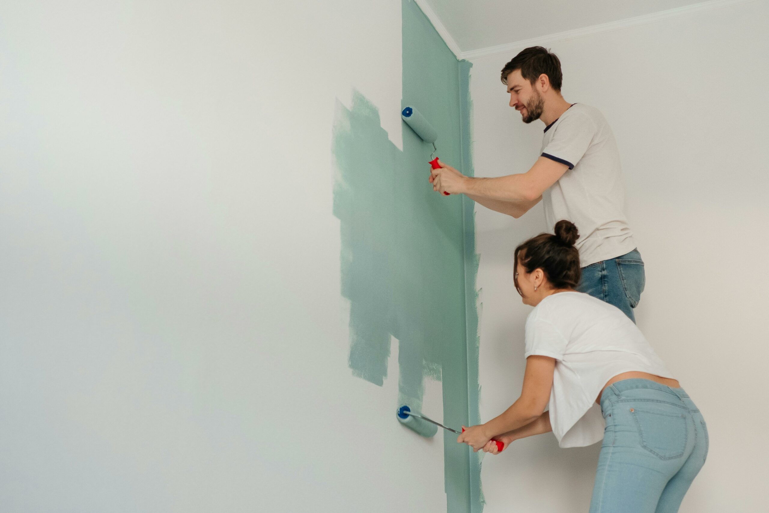
Choosing colours for your home is one of those things that sounds simple until you’re standing in a paint shop holding seventeen different shades of white, mildly panicking. Most of us have been there. You pick something that looked great on the swatch, paint an entire wall, and then wonder why it looks completely different in real life. Colour is tricky. But there are combinations that genuinely work – not just in theory, but in actual living spaces.
The Secret That Interior Designers Borrow From Hospitality
The interesting thing is that the same principles that make a colour scheme work in a home also apply to spaces designed for comfort and atmosphere, like boutique hotels and wellness retreats. If you look at somewhere like https://residencedesbains.fr/, you’ll notice how deliberately their palette is chosen – soft, layered, calming. That’s not accidental. It’s the same logic you can apply in your own home.
Why Some Combinations Work and Others Don’t

Before getting into specific pairings, it’s worth understanding the basic logic. Colour combinations work when they create a sense of balance – either through contrast, harmony, or temperature.
Contrast creates visual interest. Think dark walls with light furniture.
Harmony creates calm. Think tones from the same colour family used at different intensities.
Temperature affects mood. Warm tones (terracotta, ochre, blush) feel cosy and intimate. Cool tones (sage, slate, dusty blue) feel airy and fresh.
Once you understand those three levers, choosing a palette becomes a lot less stressful.
White and Warm Wood : The Combination That Never Gets Old
I know, I know – it sounds basic. But there’s a reason this pairing appears in virtually every interior design magazine, every Scandinavian apartment, and every café that opened in the last decade. It works because it balances cool and warm without competing.
Pure white walls with natural oak or pine furniture creates a clean, breathable space that still feels lived-in. The key is making sure the white has warm undertones – not a cold, bluish white, which will make the wood look orange by contrast. Look for whites described as “warm white”, “linen” or “off-white” on paint charts.
Works best in : living rooms, kitchens, home offices.
Sage Green and Cream : Calm Without Being Boring
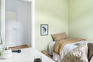
Sage green has had its moment, but frankly it deserved it. Paired with cream or warm off-white, it creates a space that feels grounded and soft without being heavy.
What makes this combination reliable is the neutrality of both tones. Neither is demanding. They sit next to each other without fighting for attention. Add some natural textures – linen, cotton, rattan – and the whole thing comes together very naturally.
A tip : if you’re nervous about painting full walls in sage, start with one accent wall or use it on cabinetry. It’s far less committal and often just as effective.
Works best in : bedrooms, bathrooms, kitchens.
Navy and Brass : Dramatic Without Being Overwhelming
This one feels more confident, and it should – it’s a deliberately bold pairing. Deep navy blue against brass or gold accents creates contrast that feels expensive and considered.
The reason it works is that navy is technically a neutral, even though it doesn’t feel like one. It anchors a space without competing with everything else, while brass adds warmth and stops the whole thing from feeling cold.
You don’t need to go full navy walls to use this combination. Navy cushions, a dark sofa, or a painted cabinet paired with brass hardware and warm lighting can be enough.
Works best in : living rooms, dining rooms, studies.
Terracotta and Dusty Pink : Warmer Than You’d Think

This pairing surprises people. On paper, two warm tones together sounds like a lot. In practice, when the shades are muted and close in intensity, the result is cosy and layered rather than loud.
The secret is keeping both tones desaturated – not bright orange and hot pink, but clay-based terracotta and a blush that leans towards mauve. Think of the colours you’d see in a sun-bleached Mediterranean room. That’s the vibe.
Add white or cream as a base – on walls, bedding, or trim – and the combination breathes properly rather than feeling closed in.
Works best in : bedrooms, living rooms, hallways.
Charcoal and Warm White : The Contrast That Works Everywhere
If you want something versatile and timeless, charcoal paired with warm white is probably the most reliable combination in interior design. It has the drama of black and white but is softer and more liveable.
Charcoal walls with white or cream furnishings create a cocooning effect without making a room feel small – provided you have decent natural light. In rooms with less light, reverse the proportion : white walls with charcoal accents (a sofa, a rug, picture frames) give you the contrast without the heaviness.
Works best in : literally any room. Bedrooms, living rooms, kitchens, hallways.
Soft Blue and Warm Beige : The Bathroom Classic

There’s a reason so many bathrooms and spa spaces use variations of this palette. Soft, muted blue – think dusty sky or pale teal – paired with warm beige or sandy tones creates an atmosphere that feels clean, calm, and subtly luxurious.
It works because it mimics natural environments – sky, sand, water – without being literal or cheesy about it. The warmth of the beige stops the blue from feeling clinical, which is always the risk in a bathroom.
Works best in : bathrooms, en-suites, utility rooms.
How to Apply These Combinations Without Getting It Wrong
A few practical points before you start painting walls or ordering furniture :
Always test colours in natural light. Paint a large swatch (at least A4 size) and live with it for a day or two. Colours shift dramatically depending on light direction and time of day.
Follow the 60-30-10 rule. Roughly 60% dominant colour (usually walls), 30% secondary colour (large furniture), 10% accent (cushions, accessories). It’s a guideline, not a law, but it helps.
Don’t match everything too precisely. A room where every item perfectly matches often looks flat. Slight variation in tone and texture within a palette is what makes a space feel natural rather than staged.
Factor in your fixed elements. Flooring, tiles, and built-in furniture aren’t changing. Build your palette around what’s already there rather than ignoring it.
Colour doesn’t have to be complicated. Pick a combination that speaks to you, understand why it works, and apply it consistently. That’s really all there is to it.